



















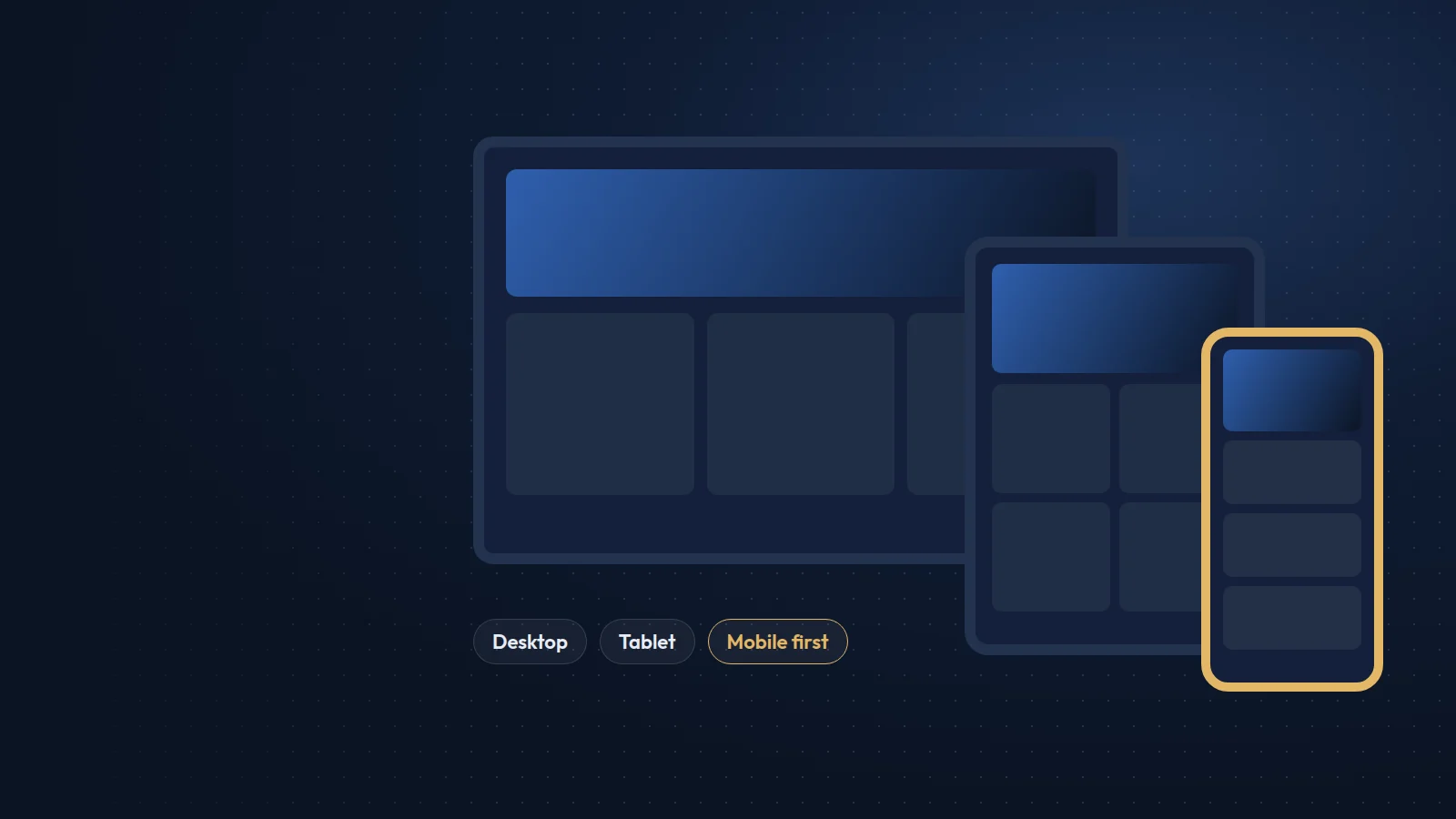
When this article was first published in 2021, mobile-friendly design was a strong recommendation. Today it is the baseline. Google finished its move to mobile-first indexing in 2023, and after July 2024 it began crawling and indexing the remaining sites with its smartphone crawler only. In practice, the mobile version of your site is the version Google reads, judges and ranks.
What mobile-first indexing means
There is one index, and it is built from what a phone sees. If content, links, images or structured data appear on your desktop layout but are hidden or missing on mobile, Google may not see them at all. A site that does not load on a phone can drop out of the index entirely.
What a good mobile experience looks like
- A responsive layout that adapts to every screen width, with no sideways scrolling.
- Body text that is readable without zooming, at 16px or more.
- Tap targets that are large enough and spaced apart, around 44 by 44 pixels.
- A navigation menu that is easy to open, scroll and close with one thumb.
- Forms with the right input types, so phones show an email or number keyboard.
- No intrusive pop-ups that cover the content as soon as the page opens.
Speed matters even more on mobile
Mobile visitors often use slower connections and less powerful devices. Compress and resize images, serve modern formats such as WebP or AVIF, defer non-essential scripts and keep fonts to a minimum. Check the Core Web Vitals report in Google Search Console, which shows real-user data for mobile separately from desktop.
Keep content equal across devices
Do not cut content on mobile to make pages shorter. Use accordions, tabs and good typography to make long content comfortable, but keep the same headings, text, images and internal links on every device.
How to test
Use Lighthouse in Chrome DevTools, check the page on a real mid-range Android phone and an iPhone, and review Search Console for mobile usability and indexing issues. If your site was designed desktop-first years ago, a responsive rebuild is usually faster and cheaper than patching it page by page.
Mobile visitors are now the majority on most of the sites we manage. Designing for them first is simply designing for your customers.