















A beautiful website that visitors cannot use is a poster, not a business tool. Most people decide in a few seconds whether a page is worth their time, and they make that decision based on whether they can see what it is for and how to move forward. Good design serves that decision.
Start with one clear purpose per page
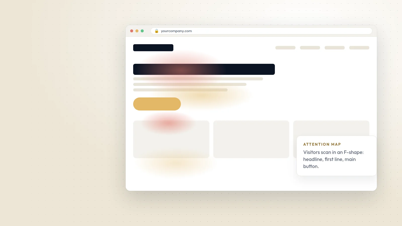
Every page should answer three questions immediately: where am I, what can I do here, and what should I do next. Put the main message and the main action above the fold, and give secondary content less visual weight. If a page tries to say five things at once, it says none of them well.
Make navigation predictable
- Keep the main menu short, with plain labels such as Services, Work, About and Contact.
- Put the logo top left and link it to the homepage.
- Use the same header and footer on every page.
- On larger sites, use mega menus or clear category pages instead of long drop-down lists.
- Show breadcrumbs on deeper pages so visitors always know where they are.
Typography and layout
Body text should be at least 16px on mobile, with a line length of around 60 to 75 characters on desktop and generous line spacing. Use one or two well-chosen typefaces, a clear heading hierarchy and enough white space between sections. Contrast matters: WCAG asks for at least 4.5:1 for normal text, and low-contrast grey text on white is still one of the most common problems we fix.
Focus on what the site has to do
Functionality comes before decoration. Forms should ask only for what you need, show clear error messages and confirm when they are sent. Buttons should look like buttons. Links should look like links. Search, filters and booking flows should work just as well on a phone as on a desktop.
Speed is part of the design
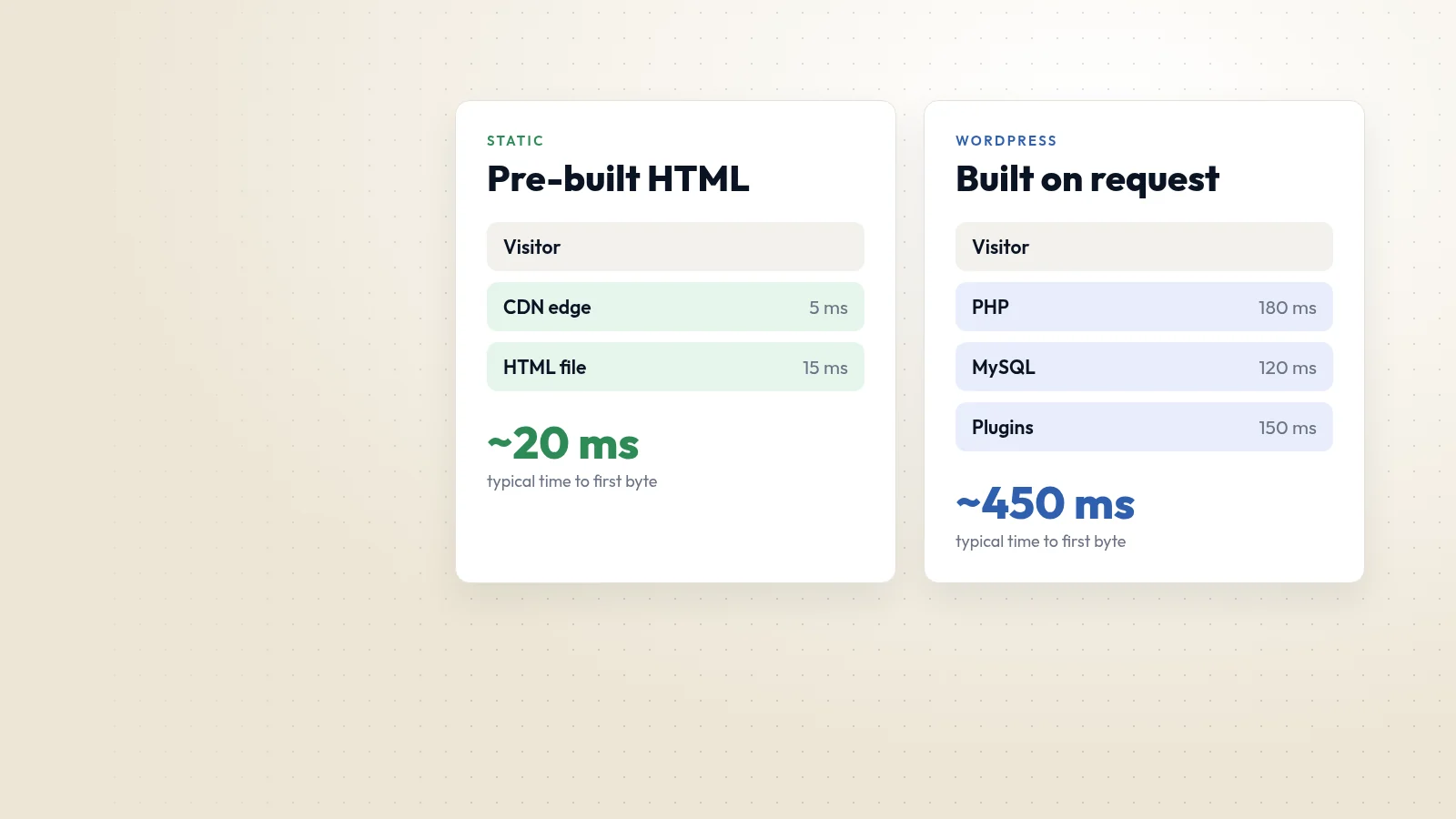
A slow page feels broken, however good it looks. Optimise images, load only the scripts you need, and test against Google's Core Web Vitals. A fast, simple page beats a heavy, animated one almost every time.
Test with real people
Watch three or four people try to complete a real task on your site, such as finding a price or sending an enquiry. You will learn more in an hour than from weeks of internal debate. Then fix the biggest problem, and test again.
Good web design is not about following trends. It is about removing friction until the visitor can do what they came for, quickly and with confidence.